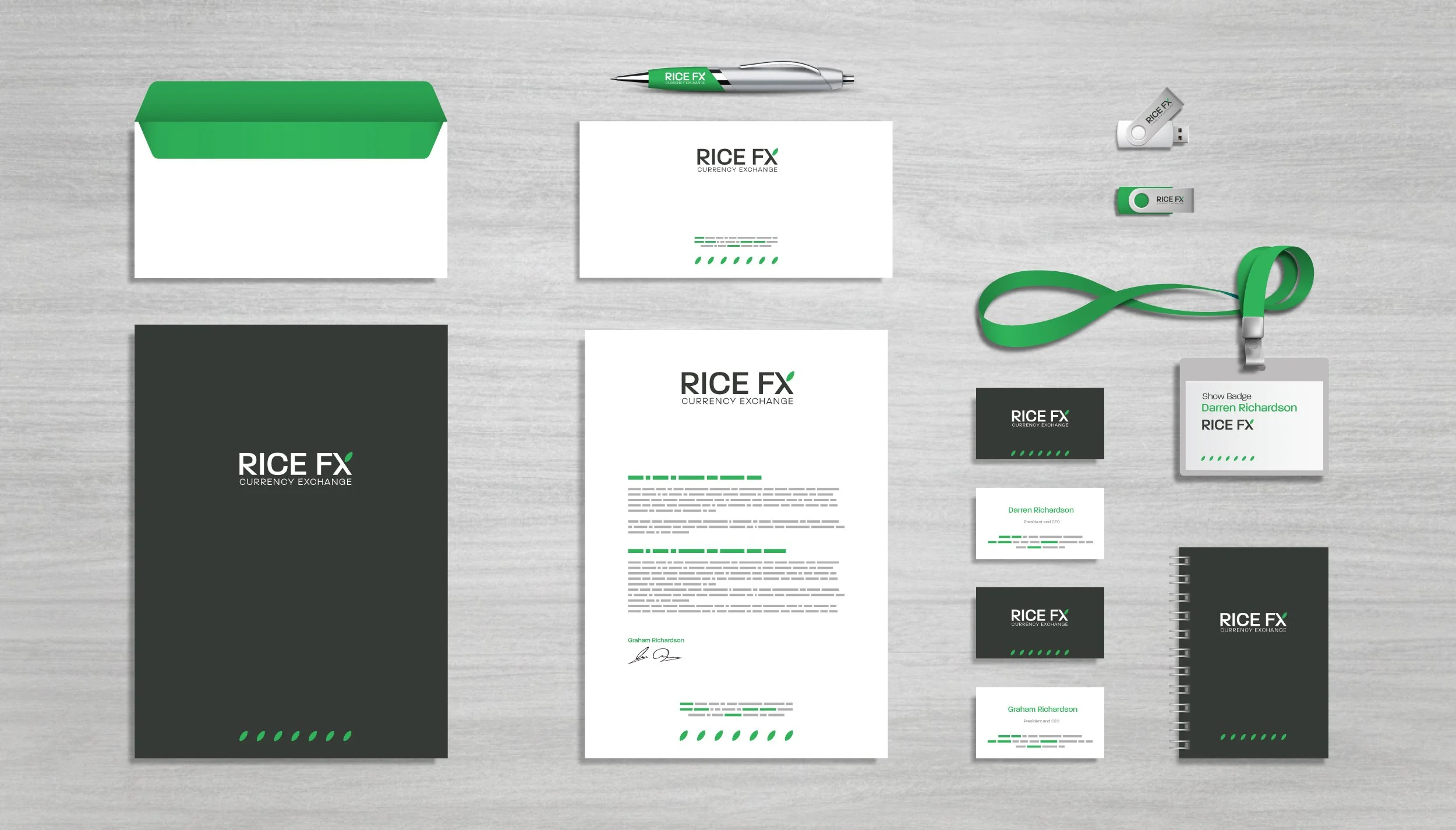
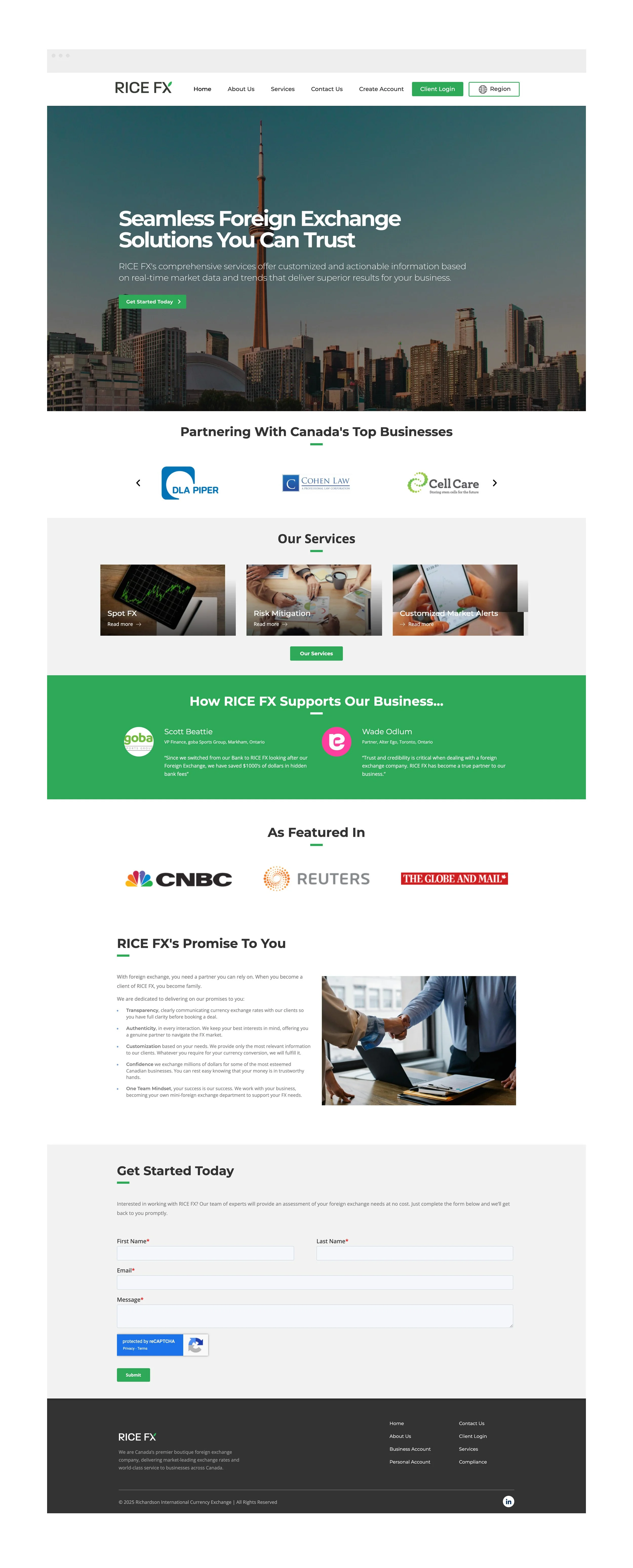
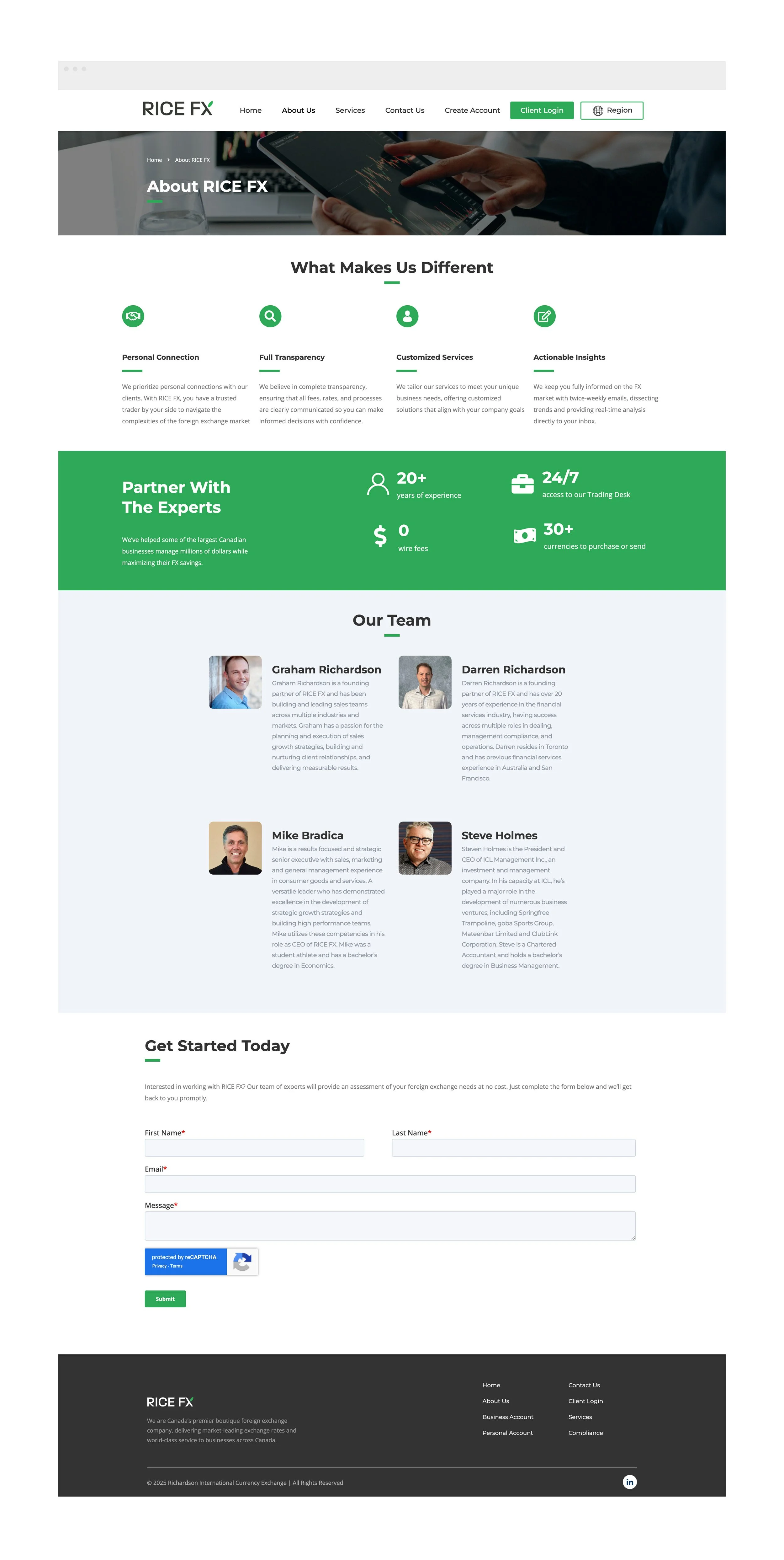
RICE FX
//
Corporate Identity
//
RICE FX // Corporate Identity //
-
CLIENT // RICE FX
TARGET AUDIENCE // Individuals and Businesses
CONCEPT // To create a corporate identity that positions the brand as a credible and professional entity in the foreign exchange (FX) industry.
DESIGN ISSUES // Creating a clean and professional visual solution for Richardson International Currency Exchange, using a grain of rice as a distinctive and relatable symbol.
DESIGN PROCESS // Collaborated with stakeholders over several months to explore and refine concepts that convey professionalism and trustworthiness.
SPECIAL THANKS // Steven Holmes, Darren Richardson, Mizanur Chowdhury, Neerthigan Sivananthan, Nolan Fowler (Fowler Content Solutions)
SCOPE // Corporate Identity, Logo design, Web Design
INDUSTRY // Financial Services